Conversation
|
This pull request is being automatically deployed with ZEIT Now (learn more). 🔍 Inspect: https://zeit.co/primer/primer-components/oq25q6r7l |
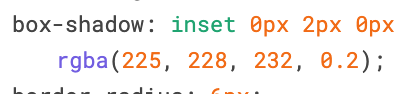
@simurai in the Figma file I'm seeing an inner shadow, has that been updated? |
No, I think it has been there from the start and I just missed it. 😇 Sorry, you can disregard my "no inner shadow" comment. |
|
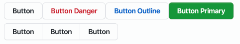
I noticed the new buttons, other than the default one, have very little change in their active state; it feels like nothing is happening when they're clicked.
Compare this to dotcom:
|
 BinaryMuse
left a comment
BinaryMuse
left a comment
BinaryMuse
left a comment
There was a problem hiding this comment.
Wow, really fantastic work @emplums! I agree about releasing this as a major version; I think it definitely counts as a breaking change, and probably deserves a major callout in the release notes.
|
@simurai @auareyou regarding the hover vs selected state - in the figma file it looks like the hover and selected state have the same background, with just a difference in the box shadow when a hovered button is selected. Is this intentional? As @BinaryMuse mentioned it's pretty subtle, and it looks like in .com there is a background change but I wasn't sure if that was left over from the button sass functions or a new background that should be applied. |
|
Going to release this as - is as the background changes in the button feels like design feedback for future iterations and can be fixed up easily here when a decision is made! ✨ |
|
Skipping a release tracking PR since this release will only contain the changes here. Updating version number in this branch. |
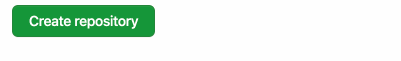
Yes, right... on dotcom we're currently testing a darker active state for buttons. Because, yeah.. it felt like there was not enough feedback when pressing a button:
Not sure if that's already final, but feel free to use the same for now. Ohh.. also, on dotcom there is a script + styles that removes that blue "focus ring" when using the mouse, but shows it when using the keyboard to navigate. That doesn't work in the Primer CSS docs. |
SideNav Visual Refresh
|
Rad! Thanks for pulling those variables @simurai! I've updated those values so this is good to go now 🎉 |
4 participants
This PR brings the new visual refresh styles to Primer Components 🎉
Even though this PR doesn't introduce any breaking changes, I still recommend that we release it as a major release since it's making pretty big visual updates to the component library. What do you think @BinaryMuse?
👉 Stickersheet
Buttons
colorshadowsetc objects in the theme.ButtonBasecomponent that all exported buttons are based on. This button has all the shared styles between the buttons, variant styles, anddisabledbehaviors. I did this so that we were not including the styles that are specific to our grey default Button in every other button component. Makes overriding styles more predictable and the internal API cleaner :)UnderlineNav
StateLabel
FilteredSearch
TextInput
Dropdown
Labels
borderColorsystem prop.BorderBox
SubNav
TabNav
General System Changes:
buttonobject in themeOpen Questions
FilteredListitems be updated?Flashbe updated?